SaaS Platform
Dashboard Redesign
B2B Data Analytics
Internal Reporting Systems
A growing SaaS platform with a dashboard that was getting harder to use every year. The team needed clarity, structure, and a simpler way for users to understand what requires their attention
Overview
This was a full redesign of the platform’s main dashboard and navigation model. The goal was to simplify the experience, reduce noise, and help users quickly get to the actions that matter
My Role
Lead UX/UI designer, strategy, IA, wireframes, UI, and design system setup. Worked closely with product and engineering to ensure a clean, scalable Angular implementation
The Problem
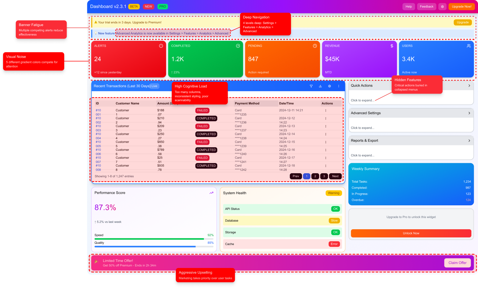
Over time the dashboard became overloaded with metrics, shortcuts, and widgets added by different teams. Everything had equal weight, so nothing stood out. Users didn’t know where to start, which slowed their workflow and increased support tickets
The platform needed a more focused experience, not more features
- No clear hierarchy
- Important actions hidden inside nested navigation
- Low discovery of high value features
- Inconsistent UI due to legacy components
- High cognitive load and slow decision making
My Approach
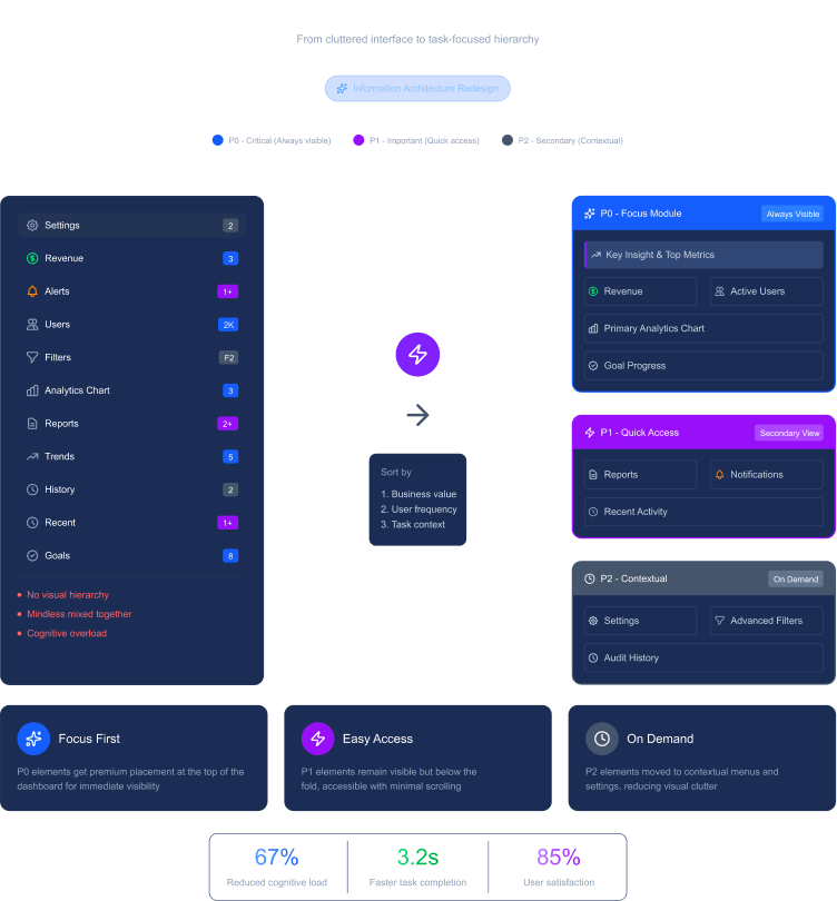
I started by mapping everything on the dashboard and understanding user workflows. I worked with product to categorize every element as P0, P1, or P2 based on actual usage and business value.
The direction was simple:
Show less, but show it better. Make the interface guide the user instead of making them think.
I also rebuilt the information architecture around user tasks, not around features, a shift that simplified the entire experience.
What I Did
Dashboard Audit & Prioritization
- Reviewed all widgets, metrics, and shortcuts
- Grouped them by criticality (P0, P1, P2)
- Highlighted which items added value and which created noise
Information Architecture Redesign
- Moved from feature-based IA to task-based IA
- Introduced a consistent global navigation model
- Pulled out hidden high value features and made them accessible
Dashboard UI Redesign
- Clear layout built around the most important action
- Added a “Focus Module” showing the main task or insight for each role
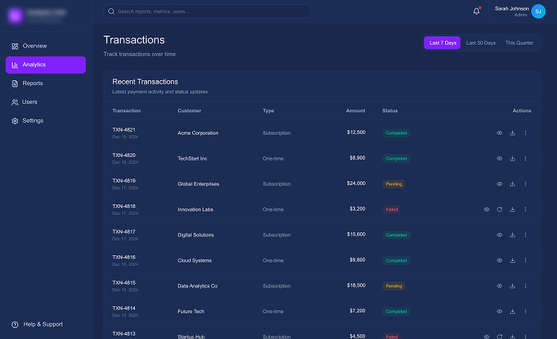
- Replaced heavy tables with small visual cues (sparklines, status chips)
- Strict, clean color system for status indicators
Design System for Angular
- Created a small component library documented in Storybook
- Unified typography, spacing, states, and behaviors
- Ensured fast and predictable development cycles
Engineering Collaboration
- Worked closely with front-end devs
- Streamlined implementation and removed old UI debt
- Helped refactor old components into the new system
The Solution
The new dashboard became a quick decision-making tool, not a long reading exercise
Users instantly knew what to do first, and the platform became easier to use daily
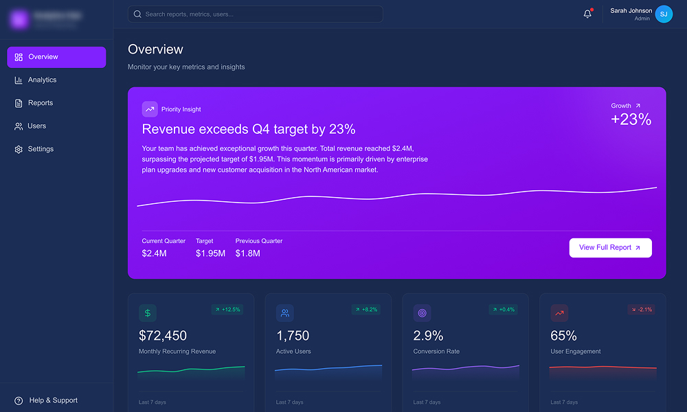
- A single priority insight at the top (“what needs attention now”)
- Clean layout with the right amount of information in the right place
- Clear navigation that made the entire product easier to explore
- Consistent UI that reduced friction for both users and the dev team
Priority Insight, What Needs Attention Now
Instead of showing everything, the dashboard guides the user to the most important action first
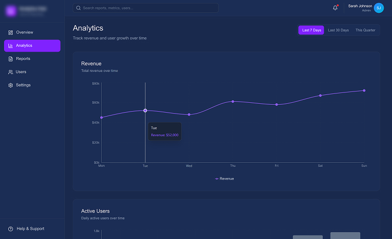
Understand the Why Behind the Numbers
Once attention is set, users can explore trends without losing context or focus
Scan Fast, Act Faster
Dense data redesigned for scannability, clarity, and quick decisions
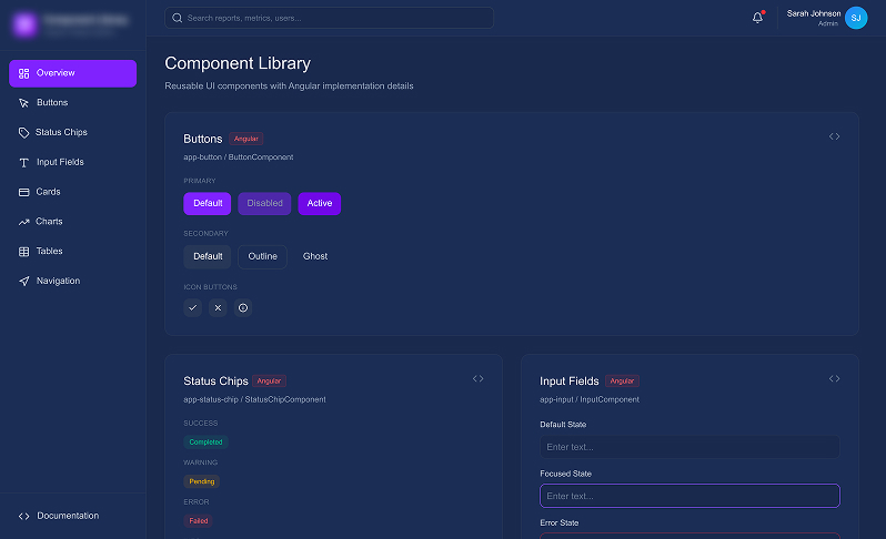
Built Once, Used Everywhere
A shared system ensured consistency, faster delivery, and less UI debt
Impact & Results
The A/B test and full rollout showed a strong improvement across the main product metrics
| Metric | Before | After | Change |
|---|---|---|---|
| Daily Active Usage | X users | 1.4X users | +40% |
| Key Action Completion | 68% | 81% | +13 pts |
| New Feature Discovery | 15% | 45% | +30 pts |
| Dashboard-Related Support Tickets | 35/week | 12/week | –66% |
The redesign turned the dashboard into a predictable, low-friction space. Users worked faster, found key features earlier, and relied less on support
Got a similar problem?
Let’s talk