Enterprise Design System
Scaling Design & Engineering Across Internal Products
Internal Enterprise Apps
HR
Finance
Ops
Multiple internal tools, fragmented UI patterns, and repeated component rebuilds were slowing teams down. This project focused on creating a single system that enabled speed, consistency, and trust across design and development
Overview
This project tackled scaling issues across multiple products and teams, focusing on creating a system that enabled fast, consistent design and development, not just visual consistency
My Role
As Design System Lead, I defined the strategy, structured component architecture, created comprehensive documentation, and ensured smooth integration with Angular, enabling teams to design and develop efficiently at scale
The Problem
Every Team Was Designing in a Different Language
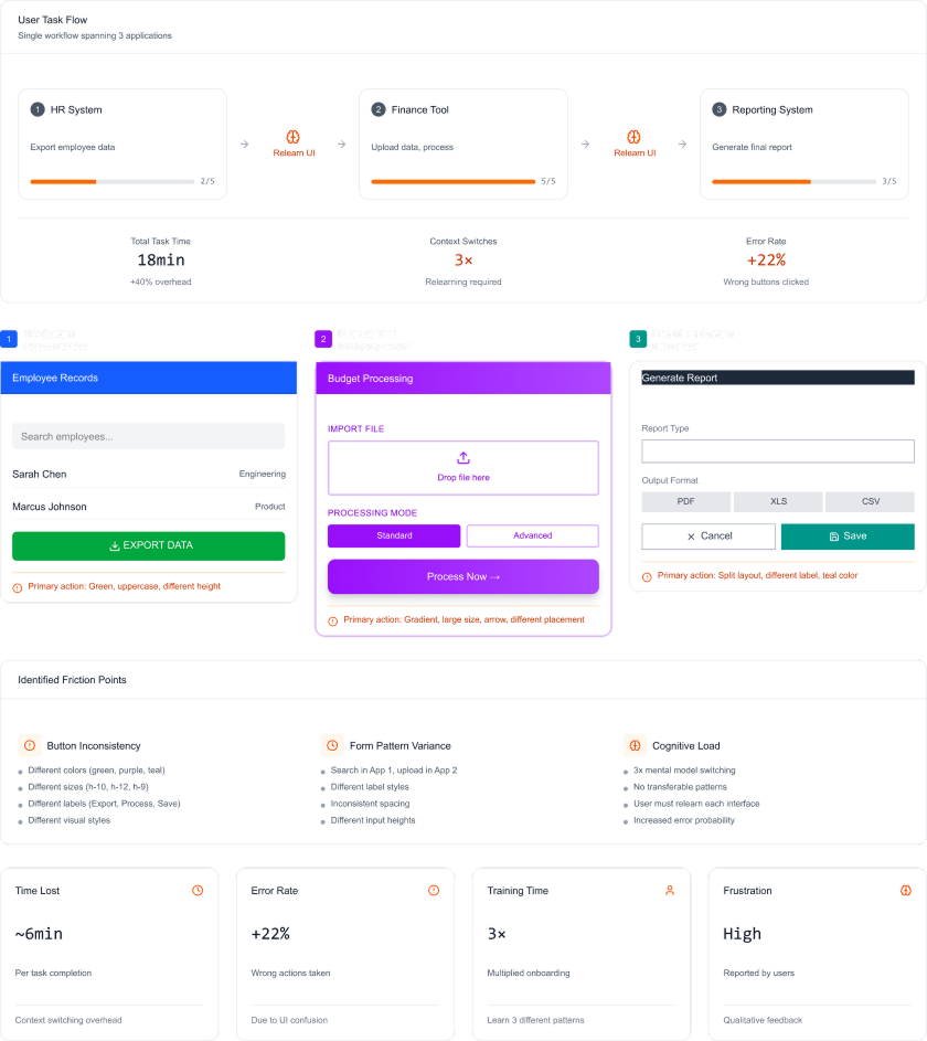
Across the company, more than a dozen internal apps had grown independently. Different teams, different rules, different UI
It reached a point where users had to relearn the interface every time they switched from Finance to HR, and developers were rebuilding common components over and over again
- Cognitive overload for users
- Wasteful development cycles
- Brand drift
- Onboarding friction
What I Did
System Audit & Component Decomposition
- Audited UI patterns across 12+ internal applications
- Identified duplication, inconsistencies, and broken interaction patterns
- Decomposed existing UIs into atomic foundations (tokens, primitives, components)
- Defined which patterns should be standardized versus left flexible
Design System Architecture
- Established the system foundations: color, typography, spacing, grid, iconography
- Defined clear component hierarchies, variants, and states
- Designed components for real enterprise edge cases, not ideal scenarios
- Ensured accessibility compliance aligned with WCAG 2.1 from the start
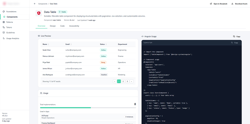
Figma ↔ Angular Alignment
- Built the full component library in Figma with engineering parity in mind
- Partnered closely with frontend engineers to mirror components in Angular
- Introduced Design Tokens to decouple visual updates from code changes
- Ensured components stayed in sync between design and production
Documentation & Governance
- Created a dedicated documentation portal (Storybook) with usage rules and do/don’ts
- Defined contribution guidelines to prevent uncontrolled component sprawl
- Established versioning, ownership, and deprecation rules
- Set up governance to keep the system scalable as teams and products grew
The Solution
A centralized, fully documented system that teams could trust and build on instantly
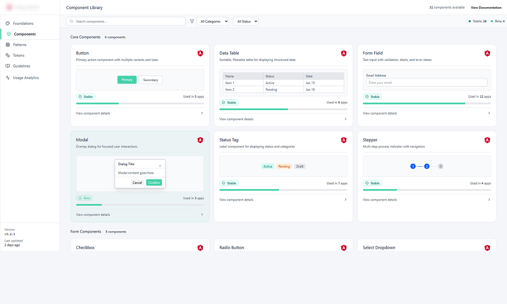
Standardized Components & Documentation
- Established the foundation: colors, typography, layout grid, iconography
- Built 60+ components with clear do/don’ts and usage rules inside a dedicated portal (Storybook)
- Aligned all interaction patterns, validation, drag-and-drop, data grids, and error handling, across every app
Angular Component Library (Nexus-UI)
- Led implementation of a shared Angular library consumed via an internal package repo
- Introduced Design Tokens so visual updates didn’t require developer involvement
- Created a phased migration plan starting with high-impact components for faster wins
Training & Adoption Enablement
- Hosted workshops for designers & developers to onboard them to Nexus
- Established a cross-functional Design System Guild responsible for maintenance, contributions, and roadmap decisions
- Positioned the system as a living product, not a one-time project
One System, Many Products
A shared Angular component library powering every internal app, designed once, reused everywhere
Where Design Meets Engineering
Each component lives as both a design asset and production-ready Angular code, always in sync
Built Once, Used Everywhere
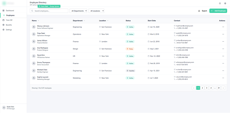
HR, Finance, and Operations all consume the same components, versions, and rules, no forks, no drift
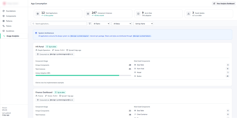
Real Work, Real Impact
This isn’t a showcase. These components run inside real internal products, every day
Impact & Results
The rollout to the first three core applications delivered immediate measurable impact
| Metric | Before | After | Change |
|---|---|---|---|
| New Feature Delivery Cycle Time | 4.8 weeks | 3.1 weeks | ~35% Faster |
| Component Reinvention Rate | ~60% | <5% | Near Elimination |
| Developer Time Spent on UI/CSS | 40% | 15% | ~62.5% Savings |
| Reported Usability Issues | High | -20% | Reduction |
Once teams stopped reinventing basic components, feature delivery became dramatically faster. That 35% improvement isn’t just a metric, it means the business shipped capabilities weeks earlier than before
Got a similar problem?
Let’s talk